The branding of ME!
Leaving university and jumping into the design world, I knew it was important to brand myself. In a largely subjective industry, a designer’s brand can have a lasting impact on their career, whether it be just beginning, or decades tenured. Keeping this in mind, I began the process of crafting my personal brand for the world to see. Below is an initial moodboard I created when thinking of the “vibe” I wanted my brand, and myself, to emanate.

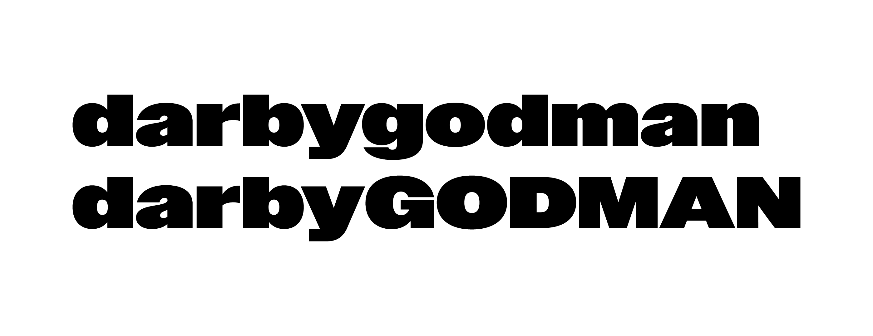
Just beginning, I knew I didn’t want to put myself into a box with my brand. I felt two identities emerging: one a harder, sans serif look, and the other, a flowing, decorative look. I decided to indulge both looks, and both feelings.
I landed on three distinct fonts I felt myself drawn to, and began testing various potential logos. I was torn between a monogram logo and a wordmark logo, so I put both to the test. See my initial tests below.


With these tests, I envisioned the brand that would exist outside each logo — the designer in and around. I enjoyed aspects of each, and could see myself attaching my name to all three. I felt myself leaning towards the top left logo, but wanted to continue experimenting.
I tried to take each design to another level with my next round of edits. I played with color and added slight typographic tweaks that would set them apart from a haphazardly typed-out logo.


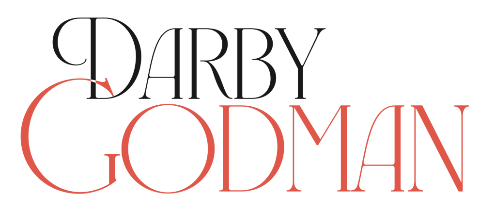
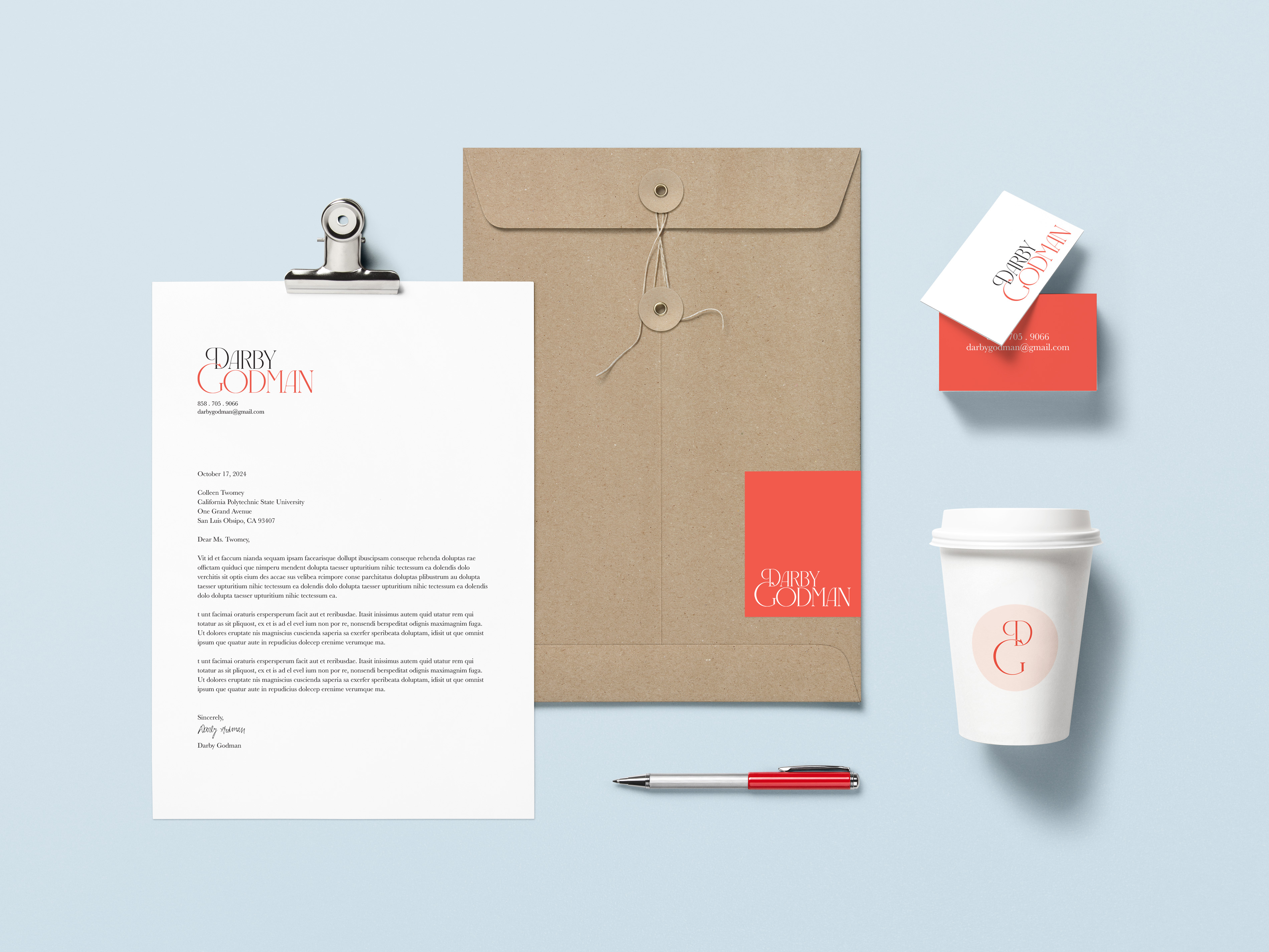
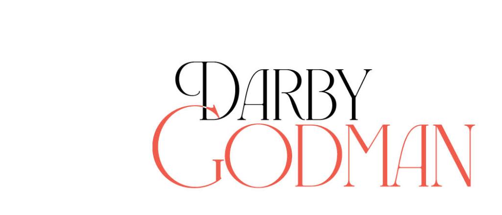
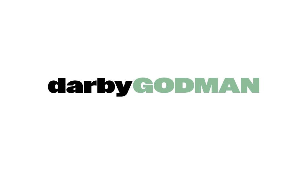
With these iterations, I felt a brand begin to emerge. I chose colors I loved and wanted to include, and each font felt like me, as different as they appeared. I loved the drama and creativity that the black and red logo radiated, while I appreciated the timely, trendy nature of the green and black logo. The yellow logos I liked, but didn’t seem to carry as much ethos as the other two. With that, I left the yellow logos behind and mocked up some materials for the red/black and green/black logos. Below are initial business card designs.


I tried out a narrow business card and a typical business card, liking the unique nature of a slender card.
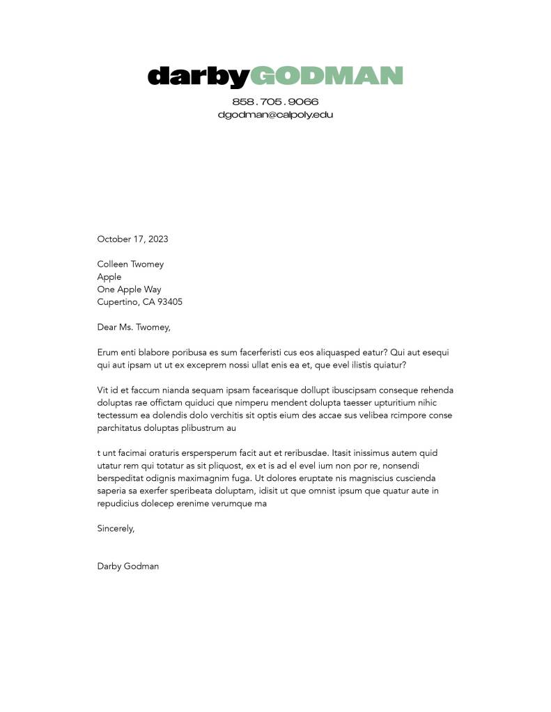
See also letterhead examples:

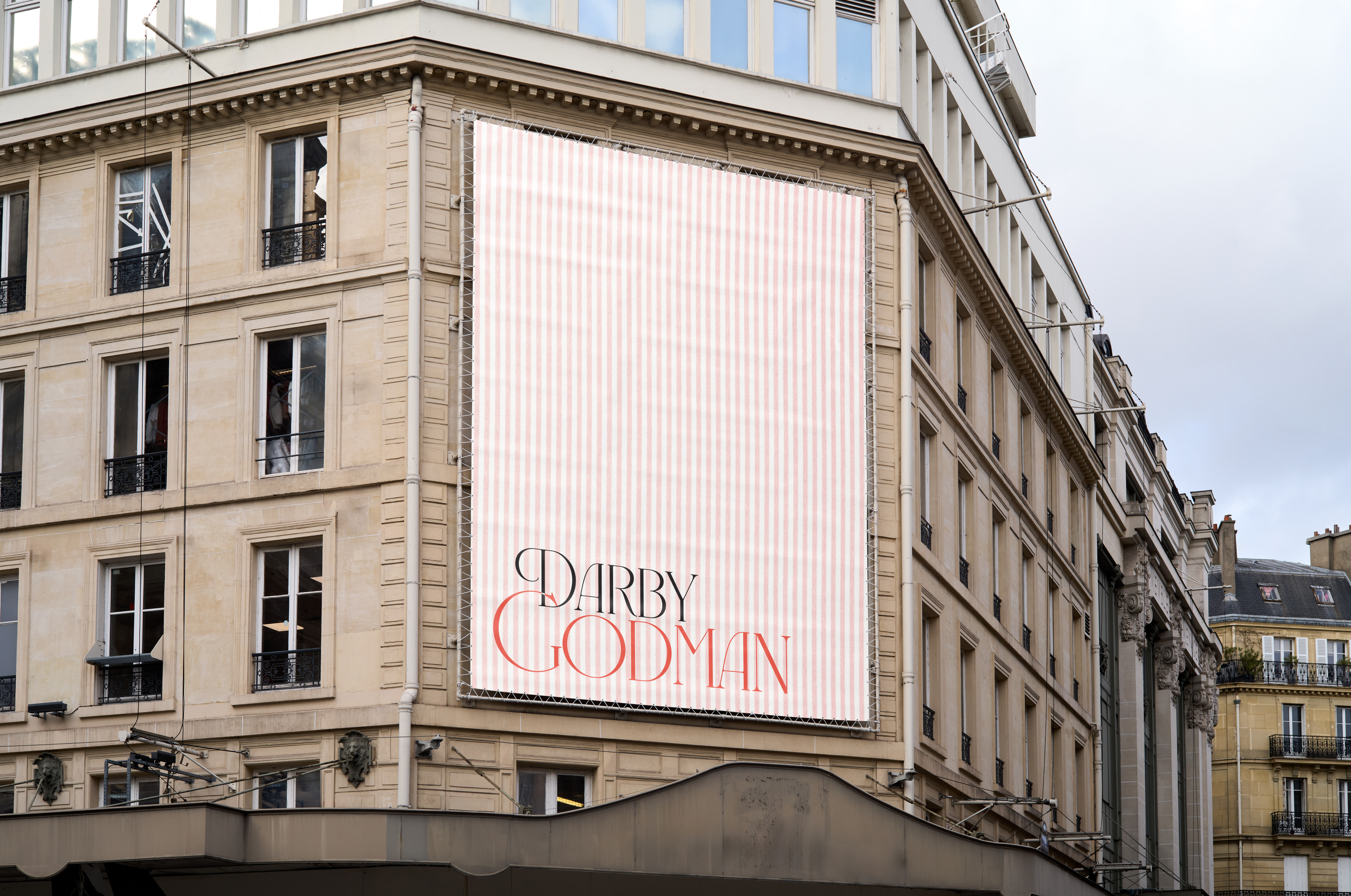
After more back-and-forth decision making, I leaned into the love I felt towards the black and red logo. I felt the green and black logo was less accessible, and too trendy for an ideally timeless brand. The red and black logo’s typeface stood out to me against other designers’ brands, feeling credible whilst still playful and welcoming to brands and customers. The red color is bold and attention-grabbing, whilst classy. With my decision made, I played with the logo’s coloring and creation of brand advertisements, also creating a monogram logo for use in place of the wordmark when necessary.