Breathing life back into a brand with boldness and flair.

Fluent Beauty, a small women-owned and operated jewelry business, had a problem: their customers had outgrown their branding. Their jewelry was evolving, while their branding was stagnant. Approaching me, Fluent Beauty’s goal was to design all-new branding to artfully curate a new, lively brand feeling. With their main selling platform being reached via Instagram, this branding needed to be eye-catching within today’s slew of social media marketing, whilst still maintaining its ethos as a trusted and beloved brand. Take a look at the brand’s previous logo as well as my first brainstorming steps below.

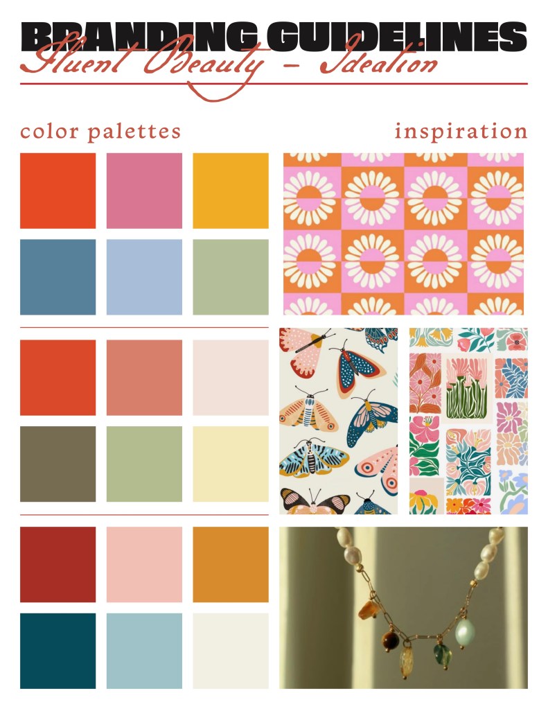
For this first round of brainstorming I decided that rather than sending over color palettes along with typography, I would simply put a focus on the color palette options next to some inspiration images. Fluent’s owner quickly let me know that the top color palette option was exactly what she was looking for. After creating a few slightly different iterations of the top color palette and landing back on the original, we moved onto brainstorming typography, seen below.

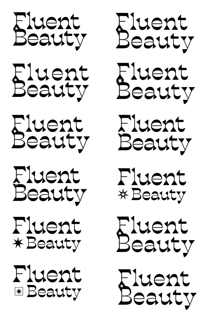
After looking over these font choices and discussing the certain elements we liked and disliked of each typeface, the owner and I began looking at four specific typefaces in varying cases. We decided a wordmark logo would be best, with a symbol and monogram logo as secondary choices.

Reviewing each of these, the owner landed on the first typeface in its titlecase form. From there, I moved into logo development. First working on the wordmark logo, I began to experiment with type customization and negative space.
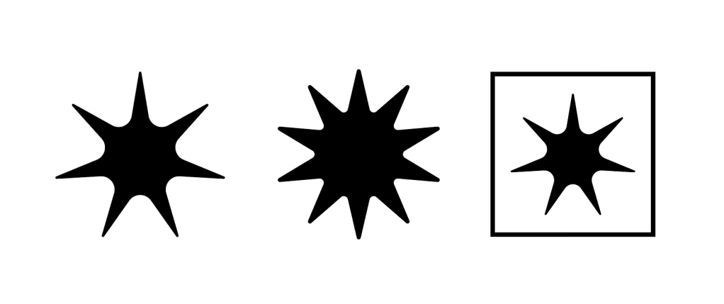
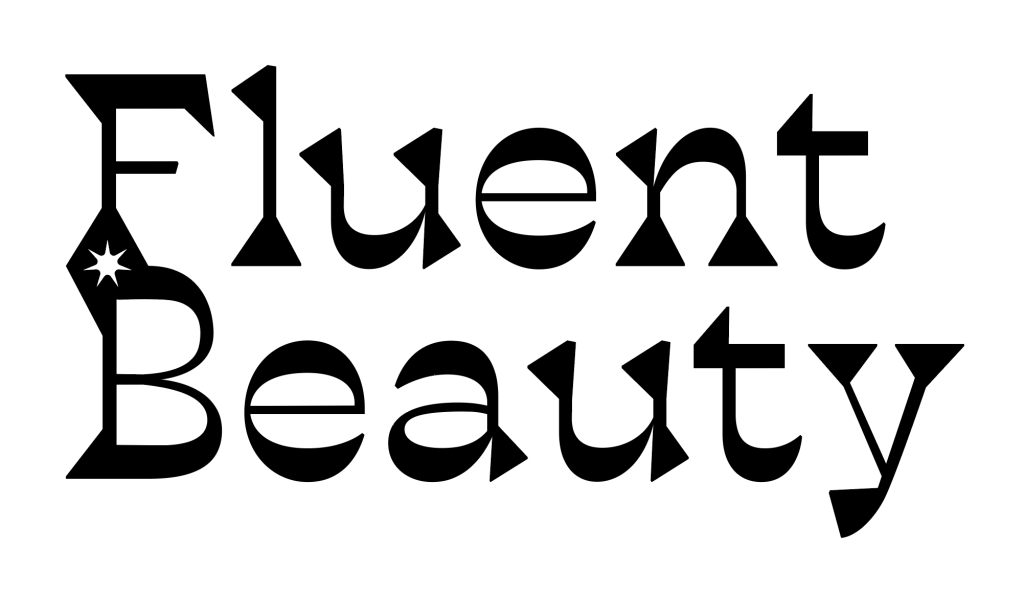
My first ideas were proving to be the favorites for Fluent’s owner, as she wanted to keep working on the top left logo. This logo utlized a negative space star that connected “Fluent” to “Beauty.” So, my next step was playing with the star itself. See below a few of the designs.
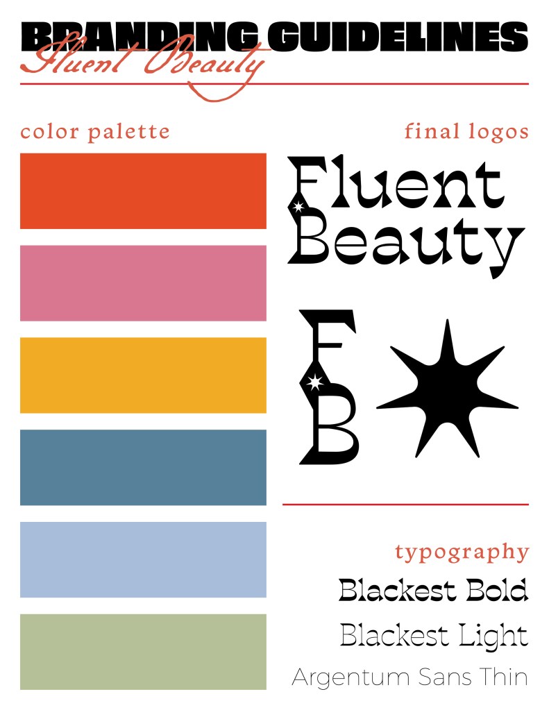
After getting the star just right, I had to implement many small aesthetic manipulations to the logo. For example, I made sure that the strokes across the entire logo were more uniform than the original untouched typeface as to aid in readability. I also made sure that the stems of the letters F and B lined up perfectly for a more professional look. Take a look at the final customized wordmark logo below.
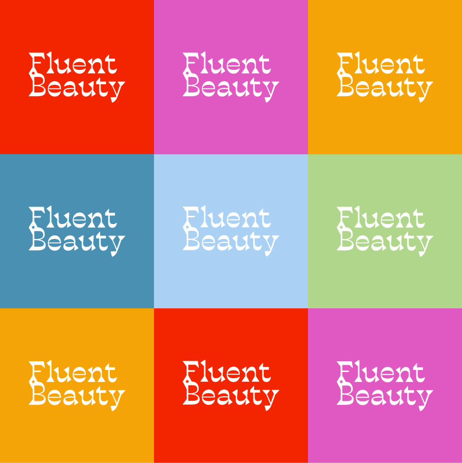
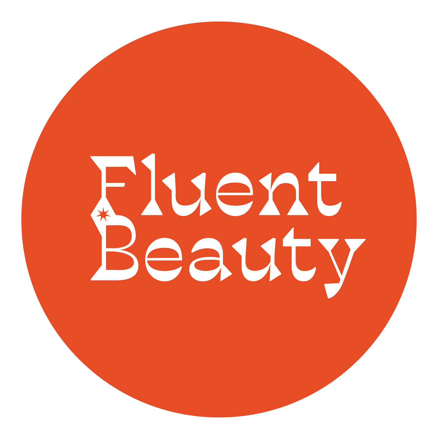
My next step was adding color to the wordmark logo and the star symbol logo so that the owner could get a full feel of her new brand identity.
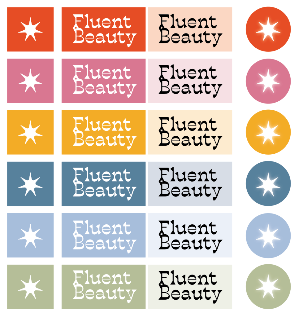
Along with color, the monogram logo came about during this phase of the process by separating the F and B from the rest of the wordmark logo.

For this brand, eye-catching designs were a must. In a highly saturated market of social media-based jewelry companies, we needed this rebrand to be fresh and bright so that consumers would be likely to click on a purchase link rather than scroll past another beige and black jewelry pouch. See below some packaging mockups and the final branding guidelines for the new Fluent Beauty.