I recently have had the pleasure of working with Aurora Designs, a woman-owned jewelry company based out of San Diego, California. Aurora’s owner came to me with the hopes of redesigning and elevating her brand. She wanted an timeless feel and a true sense of elegance to emanate from her logo and brand as a whole. Pictured below is the previous Aurora Designs logo. It lacked sophistication and timelessness. It was busy, and didn’t lend itself well to advertisements. My goal moving forward was to create a logo that was less trendy and more polished, allowing for Aurora Designs’ ethos to grow.

My first steps in redesigning the brand and brand guidelines involved creating an inspiration and idea sheet with various fonts, color palettes, and inspiration images. See below both version one and version two.
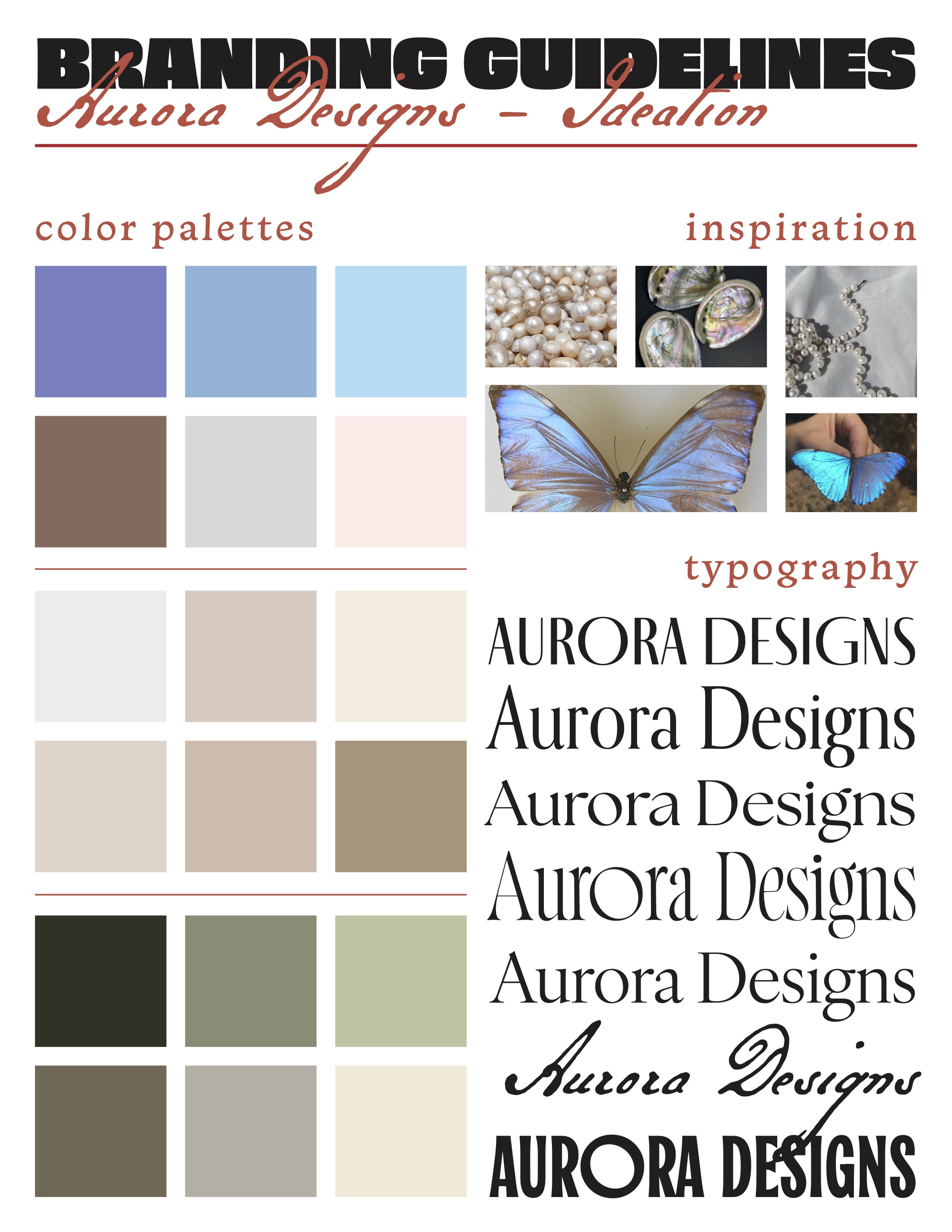
For this first round of ideation, Aurora’s owner decided on two fonts she wanted to explore (fourth and fifth from the top). For a color palette, she decided she did not want to use dark shades, but instead focus on light hues, specifically purples and tans.
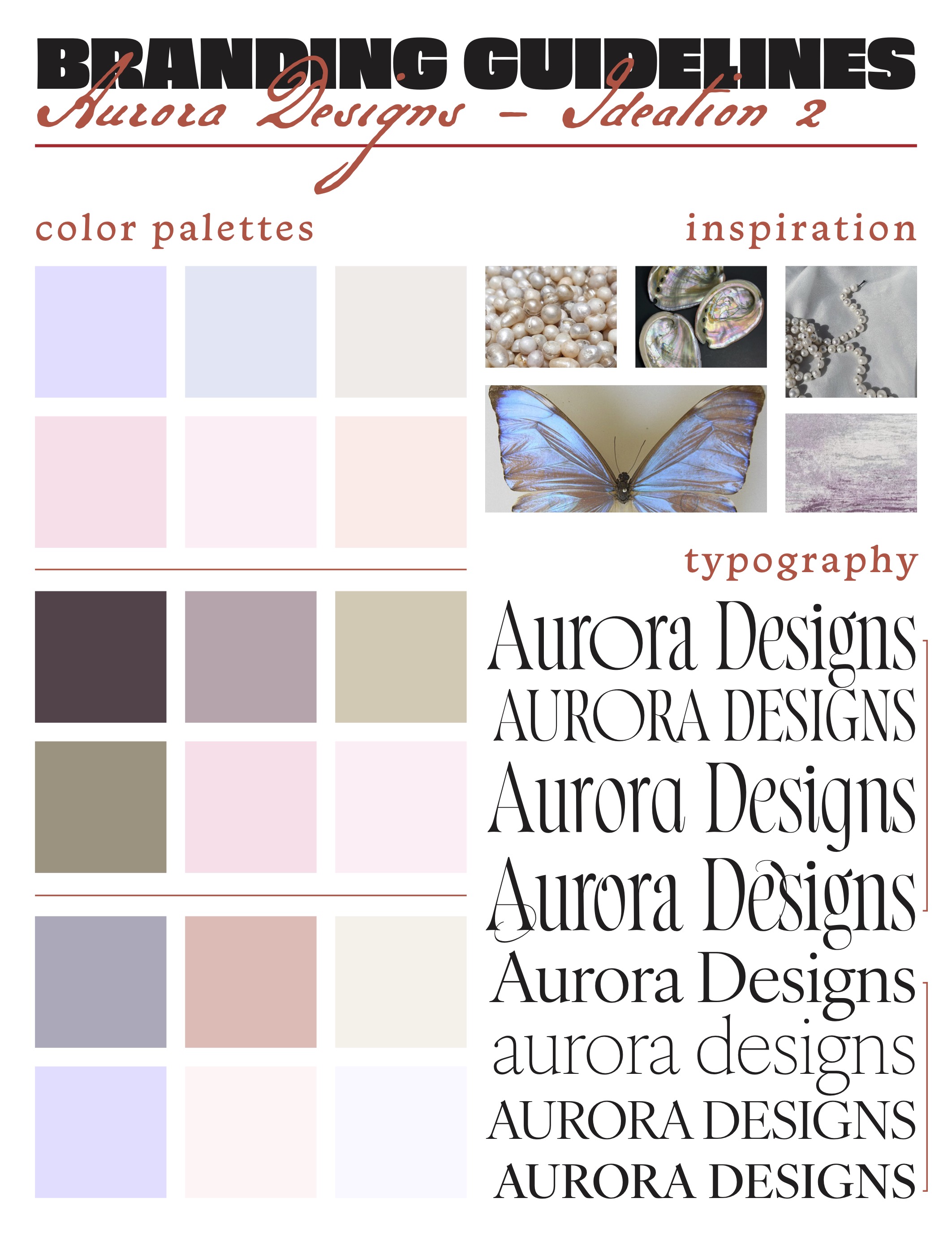
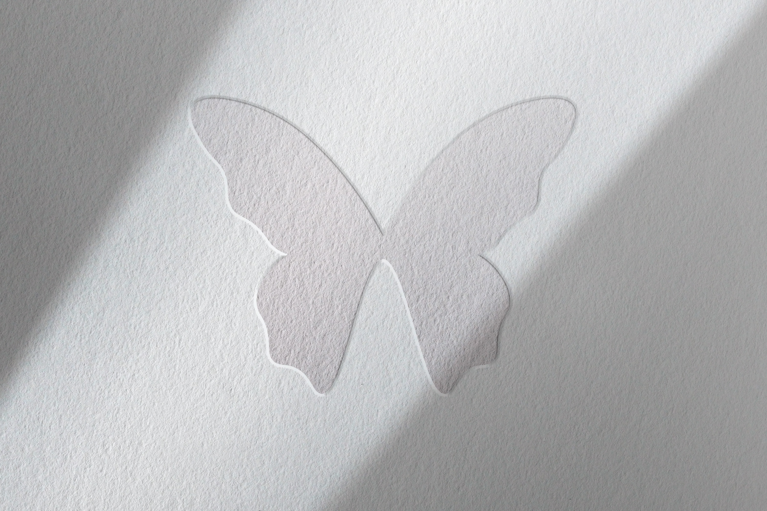
For this second ideation, I used both typefaces the owner favored from the first round of ideation. I experimented with different line weights, swash characters, and small caps. The owner loved the bottom font family, IvyOra Display, and decided this would be her brand’s typeface. She also wanted to incorporate a butterfly symbol.


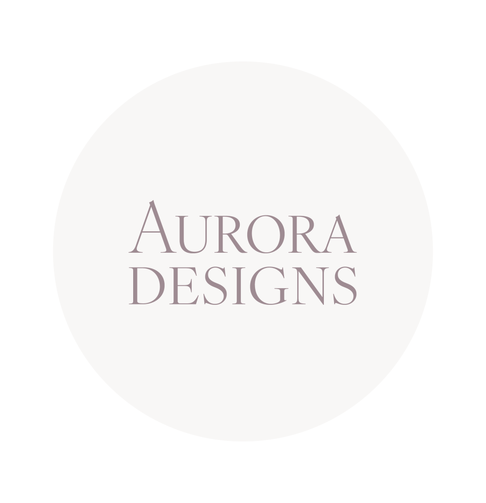
Above are some of the first logos I drafted for Aurora Designs. Some are placed within a circle as Aurora Designs’ main advertising platform is Instagram, and I drafted them as they would look in a profile picture. After seeing these designs, Aurora’s owner decided to move forward with a wordmark logo, and a symbol logo of a butterfly. She wasn’t sure if she wanted to combine the two or keep them separate, so I gave her options.
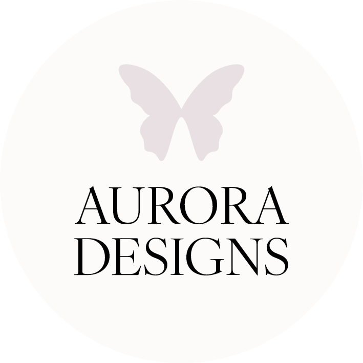


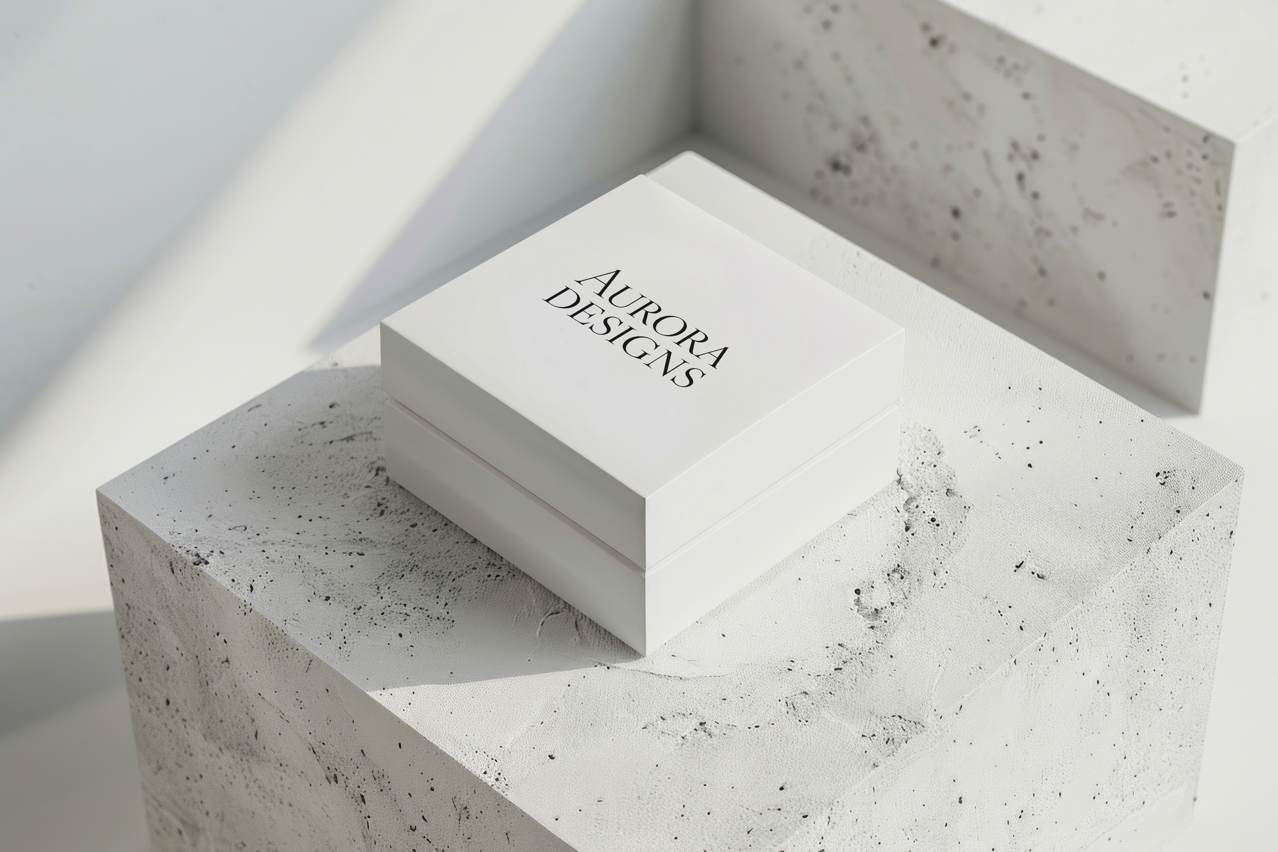
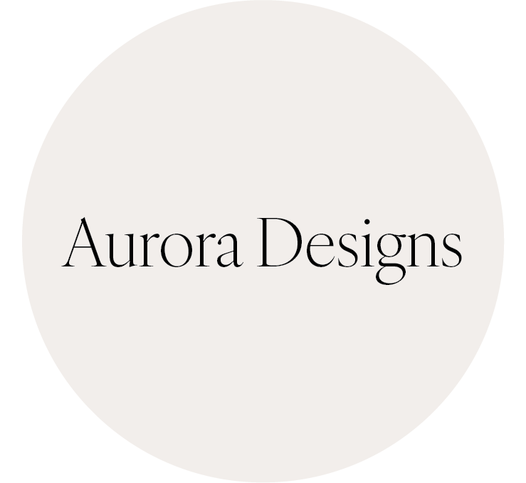
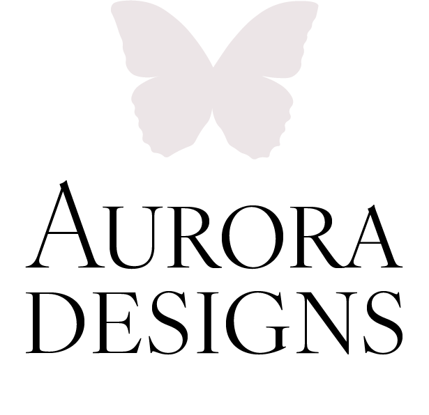
After more drafting, revising, and feedback, Aurora’s owner settled on her final logos, shown below in her brand style guidelines sheet.

Say hello to the new Aurora Designs.