Watch as Good Juju comes to life through hand-drawn lettering and comforting colors.
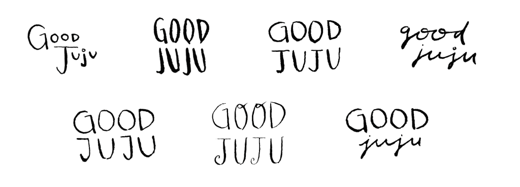
Good Juju is an emerging brand, centered around meeting local culinary needs. A woman-owned business, Good Juju provides catering services, baked goods, and various prepared food items for purchase along the central coast of California. I was tasked with designing the brand logo and guidelines, along with creating various collateral materials and digital designs. Good Juju’s owner came to me hoping to create a whimsical brand that still had a professional look and feel. We decided that to achieve this, I would hand draw the logo and brand icons. Below shows the initial brand ideation looking at inspiration images, potential color palettes, and typography styles.
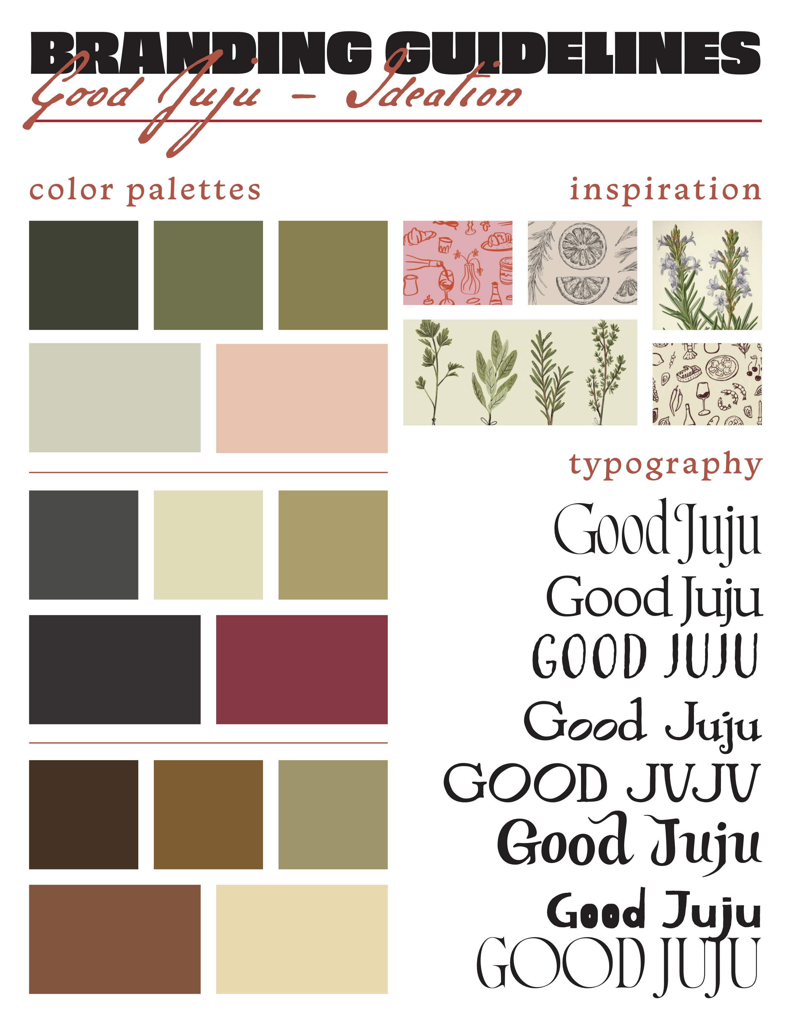
After reviewing these initial ideas, Good Juju’s owner favored the topmost color palette idea, and the first (from the top), third, fourth, and fifth typeface ideas. My next step was then to start drafting hand-drawn logos.
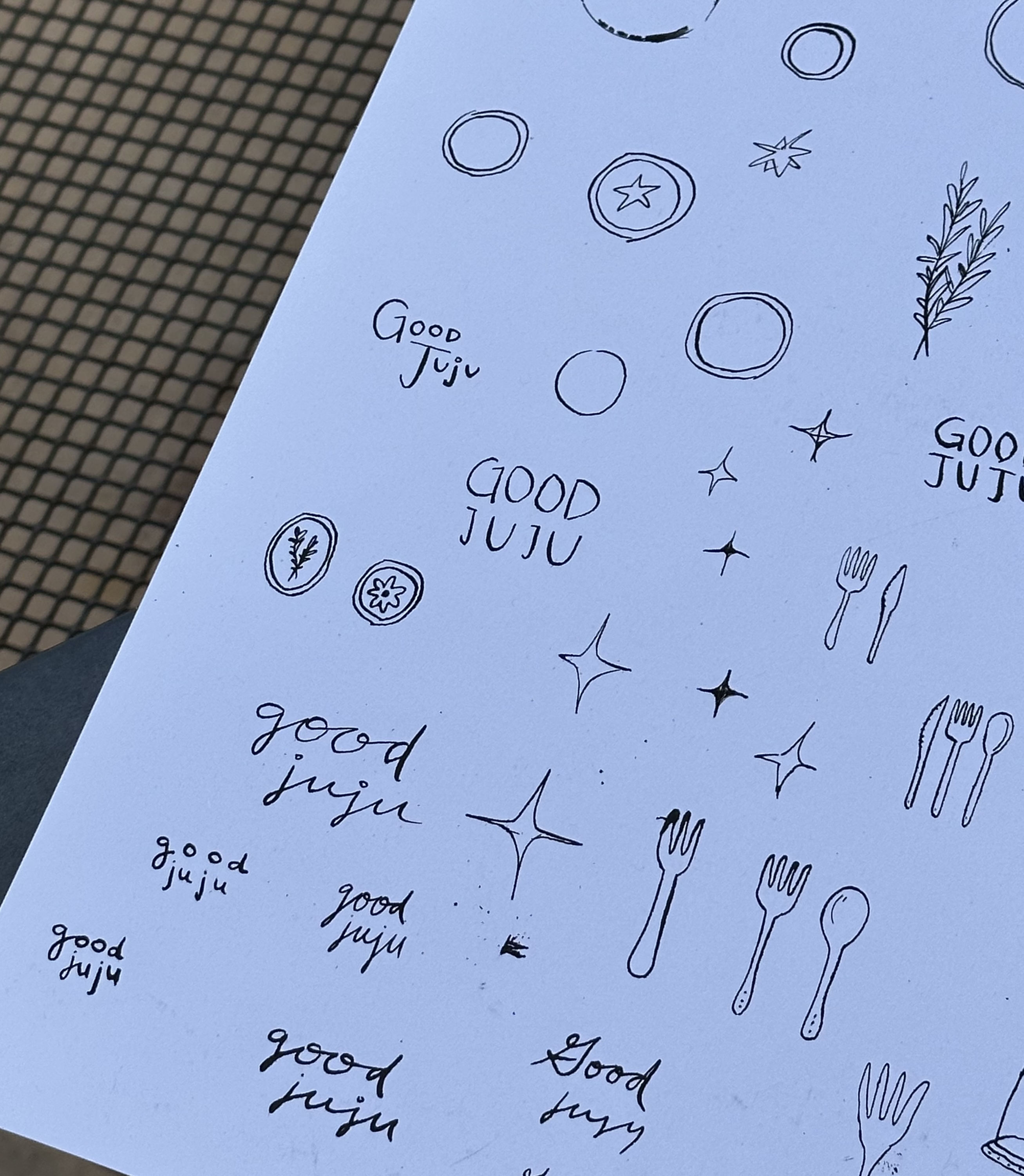
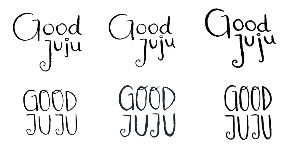
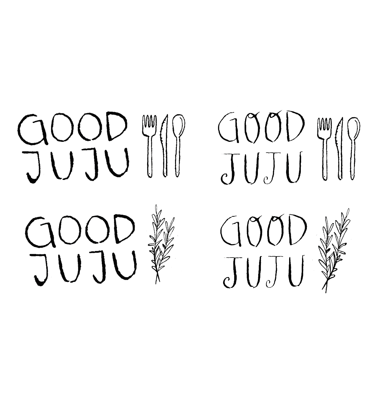
To create a unique vintage and playful feeling, I created these logos using a calligraphy pen and various nibs. I drew many wordmark logos, along with ideas for potential symbol logos, or brand icons.
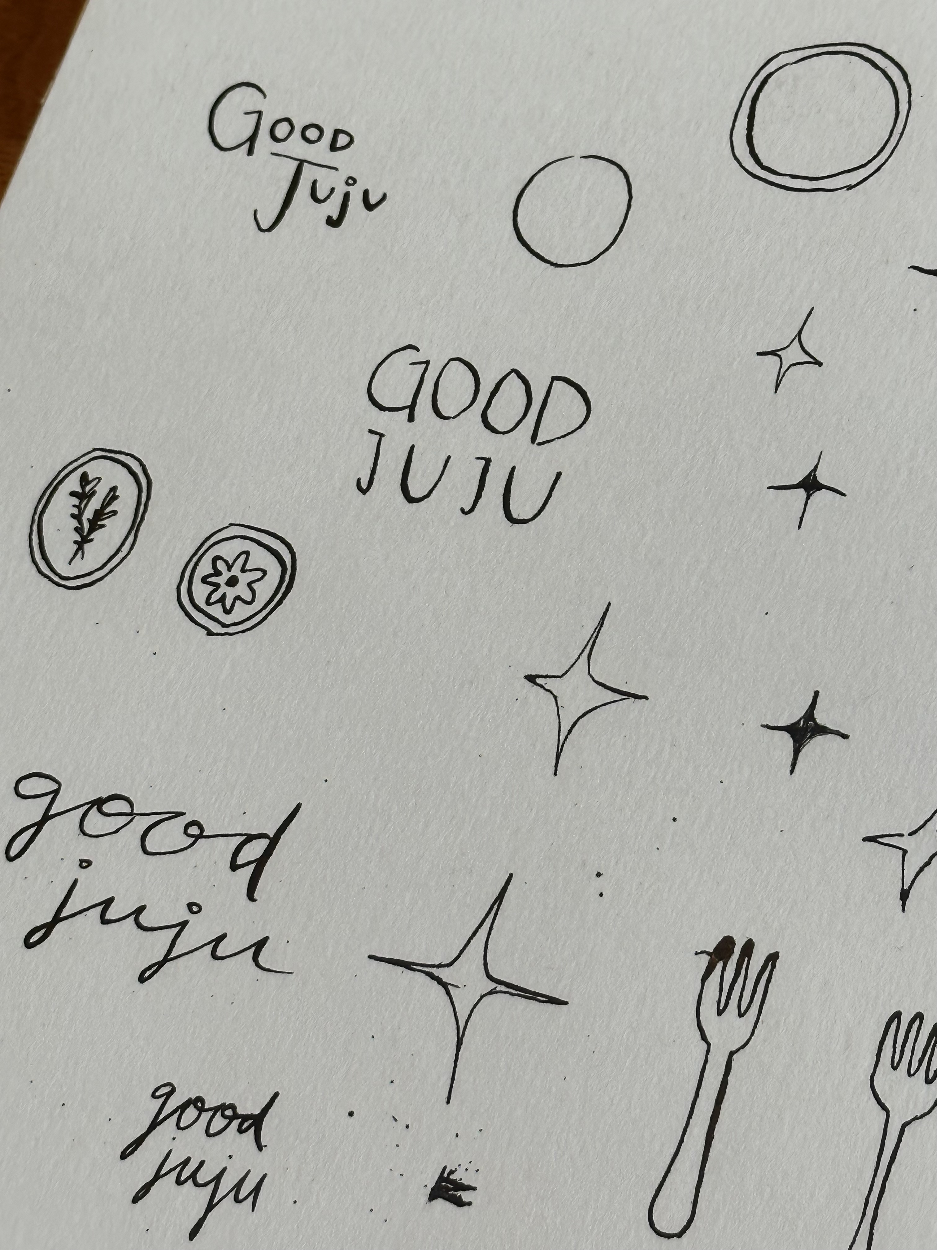
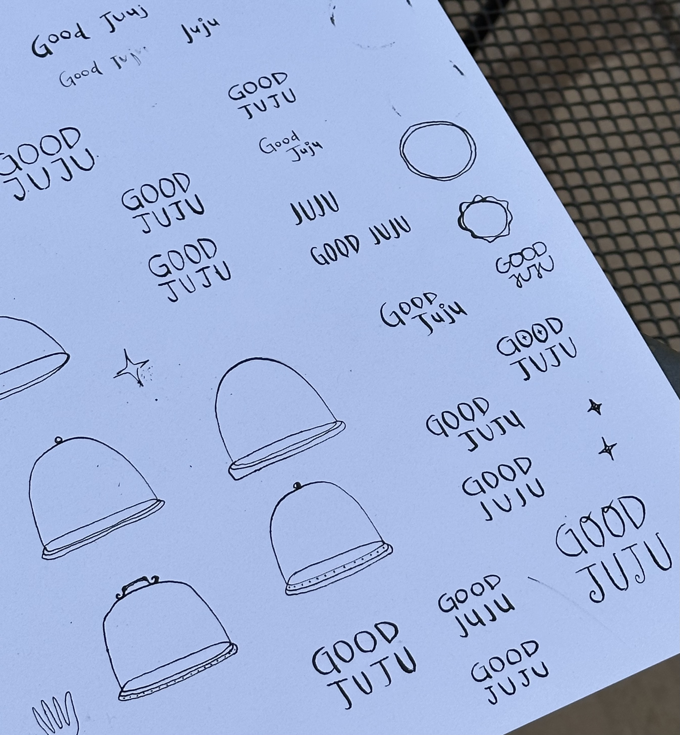
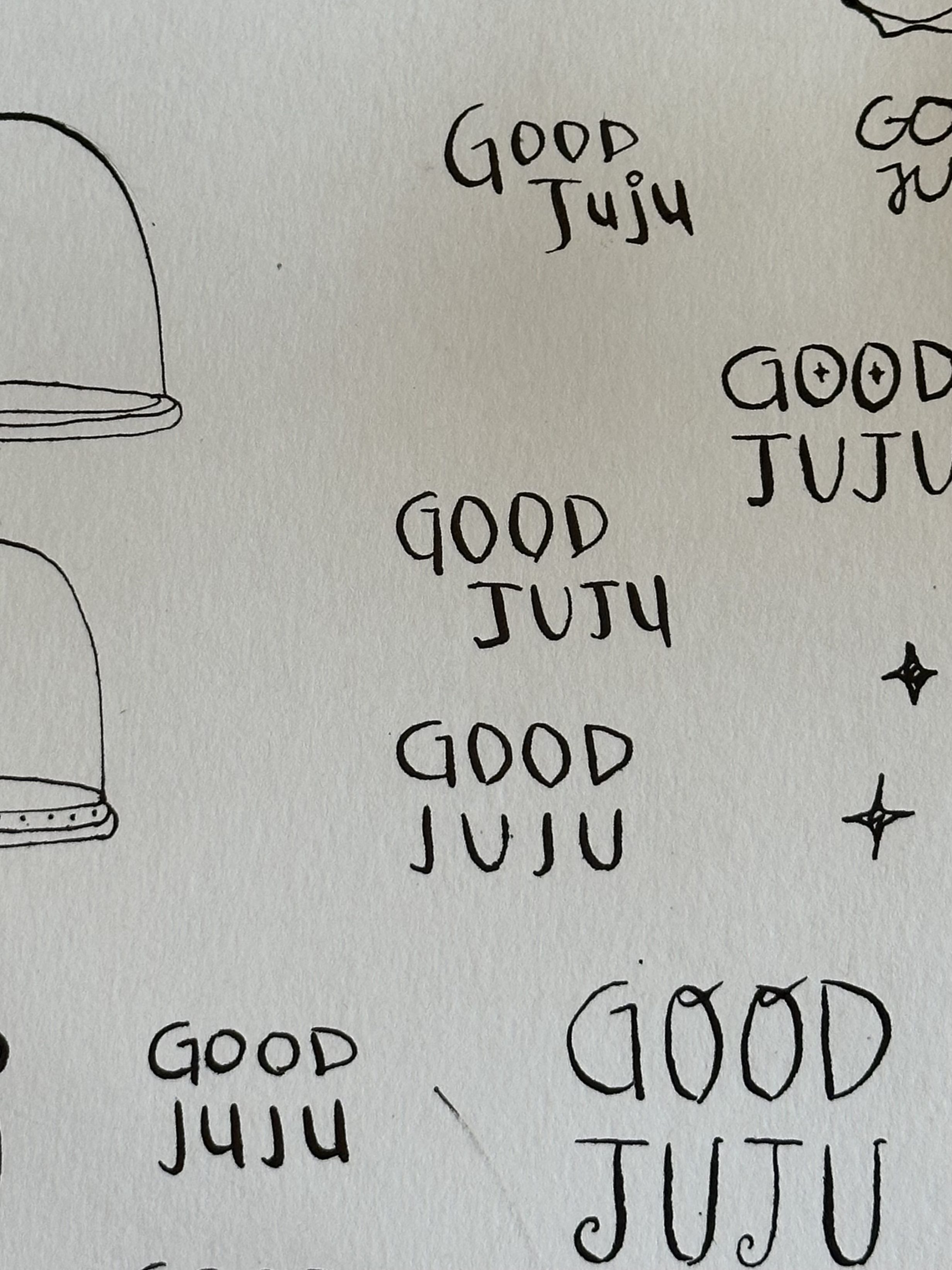

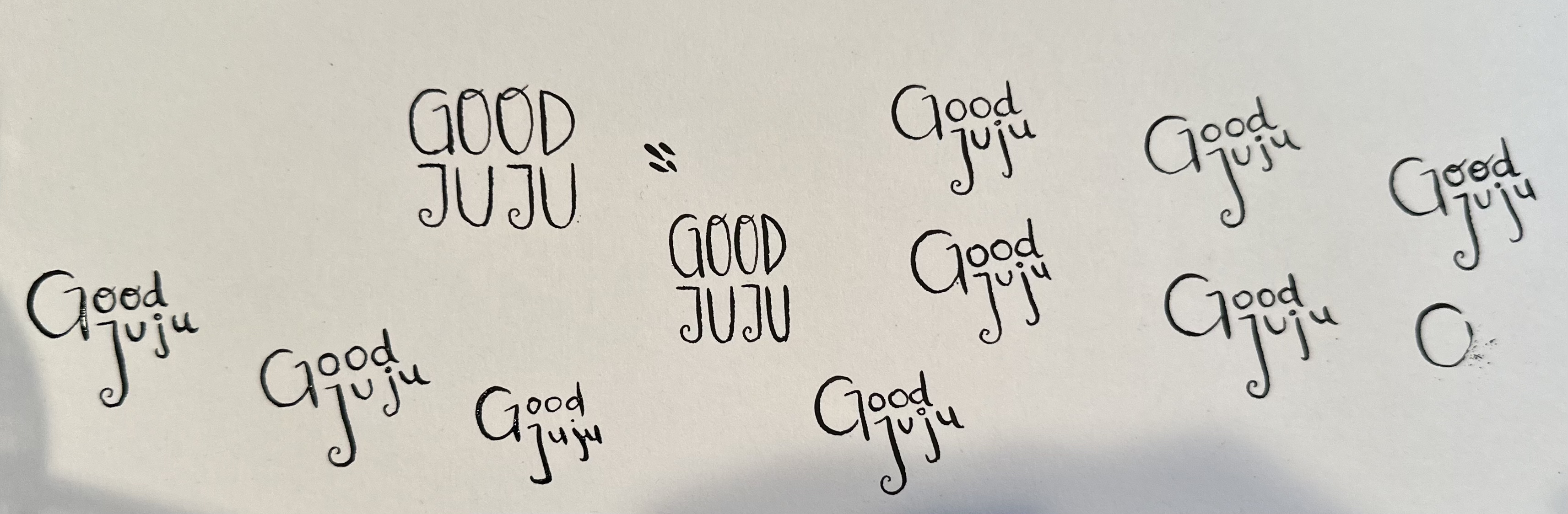
After drawing dozens of variations with different feels, I scanned the best of the bunch to pitch to Good Juju’s owner. Bringing them into photoshop, I made sure each logo was darkened and “cleaned up,” tweaking them to be conducive to the brand’s ethos.


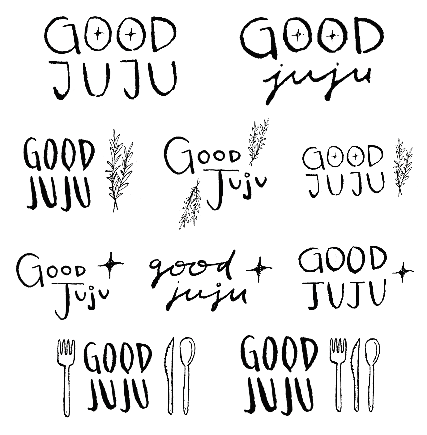
Above is just a portion of the proposed logos. I played with different cases and illustrative icon sketches. At this point, the owner wasn’t sure whether or not the icons would be included in the logo itself, or just used for other branding purposes.
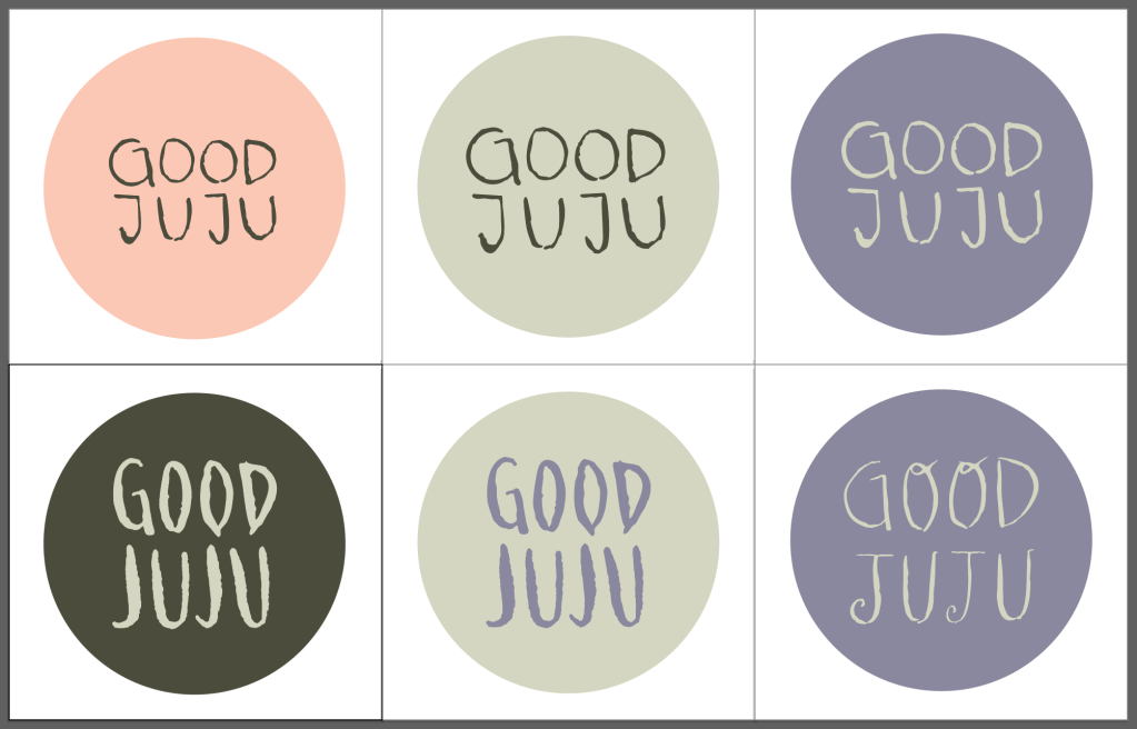
After days of talking through each logo and the pros and cons of each, we decided to move forward with the illustrated icons, and focus on a few logos in particular. I then moved to put these logos into the new chosen color palette (below) and into some variations of a social media profile photo. This way, the owner would begin to see the logo in some of its potential real-life scenarios.

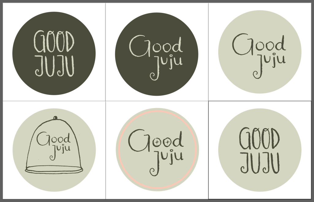
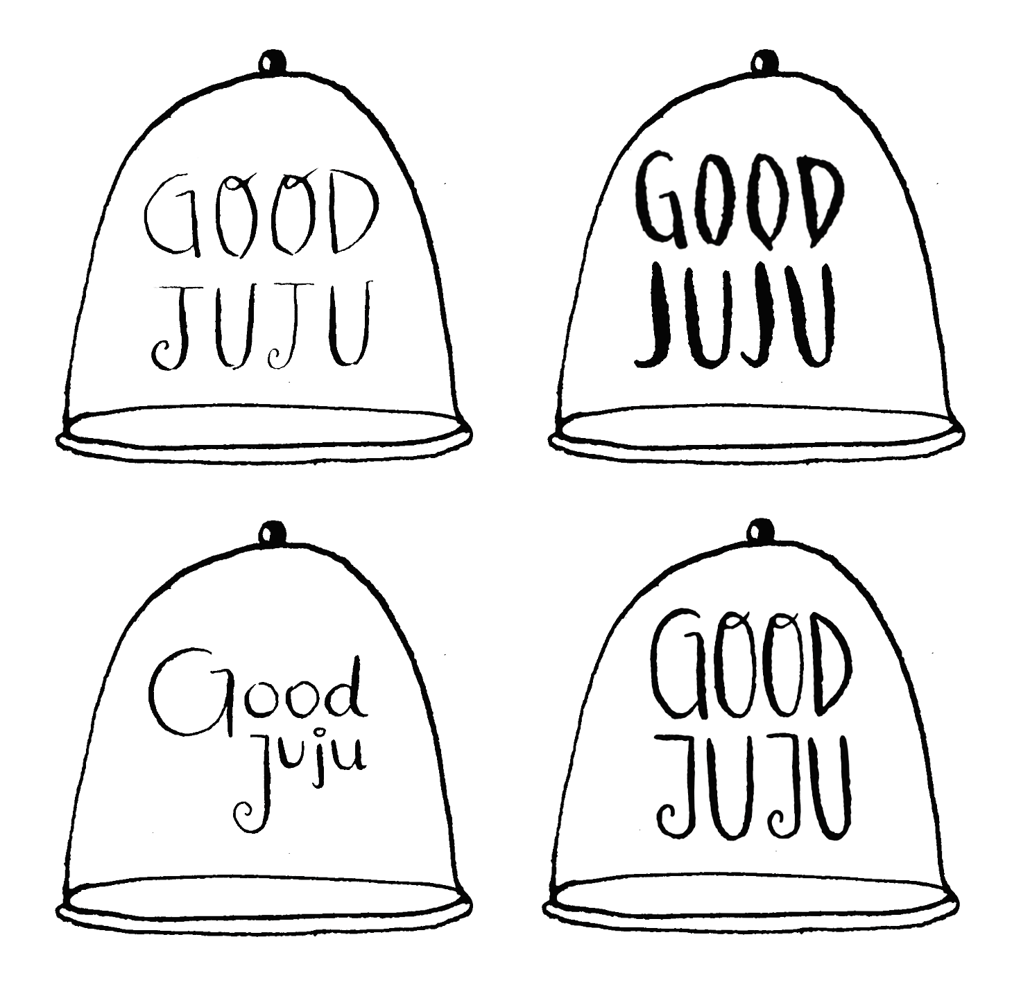
After this round of drafts the owner decided on the chosen logo, seen below, then wanted to decide whether or not to include the illustrated star icon within the logo itself. Below are a few of the options I sent over, again putting the logo in the context of a profile photo.
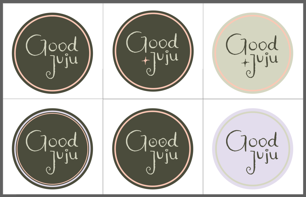
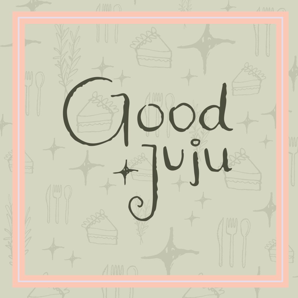
After seeing these versions, the owner was ready to decide, ultimately choosing the version of the logo that has the star icon between the “G” and “J.” For the Good Juju profile photo, the top middle was chosen. See below the final results.
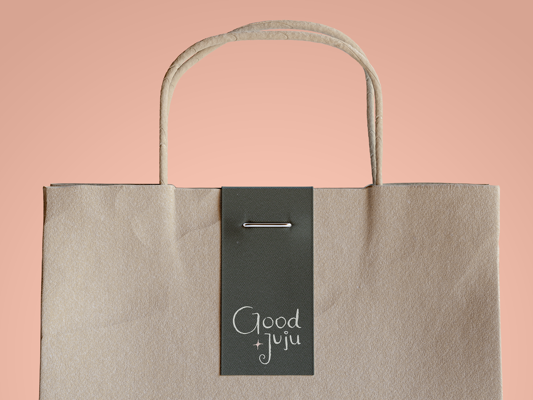
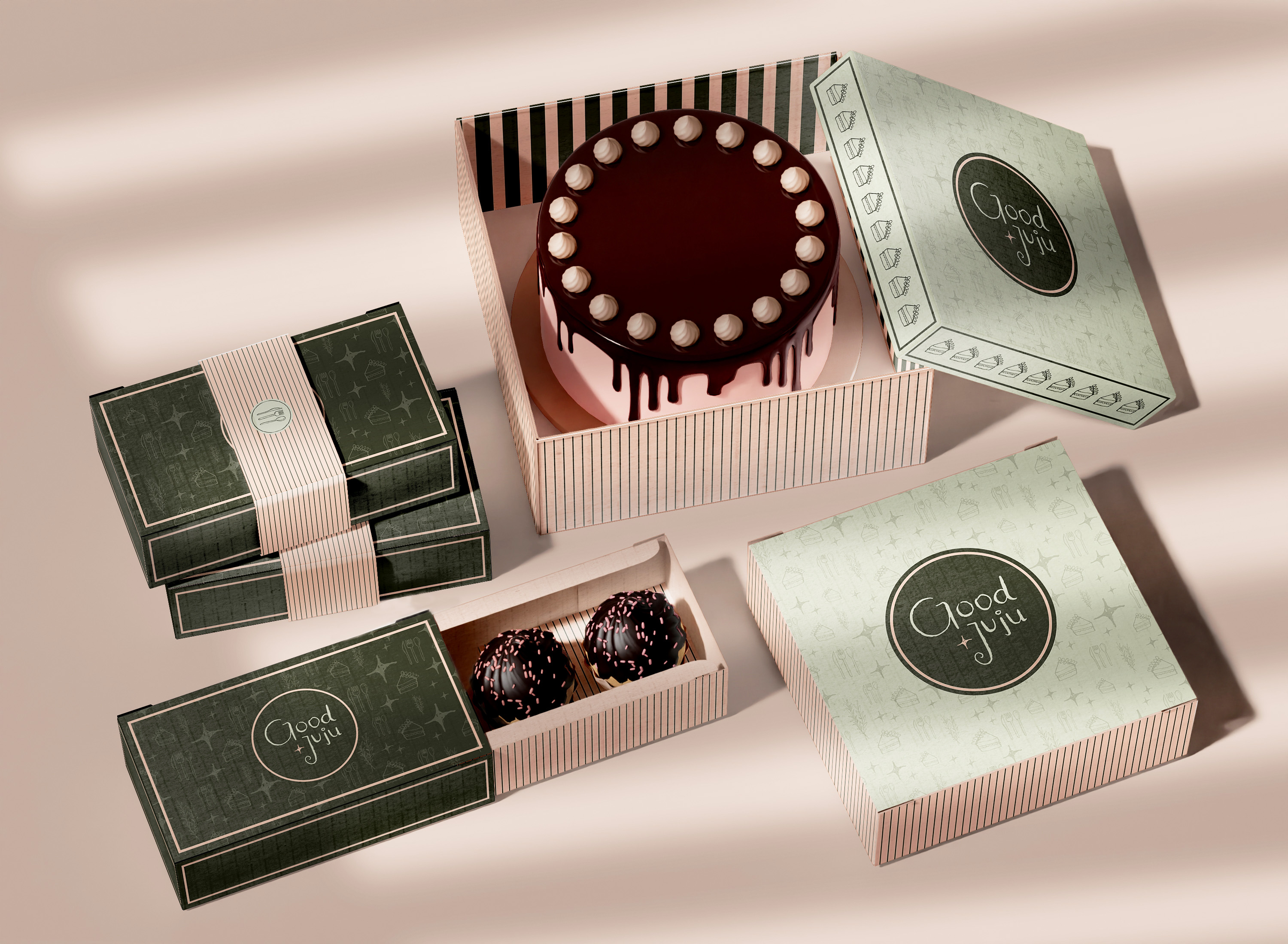
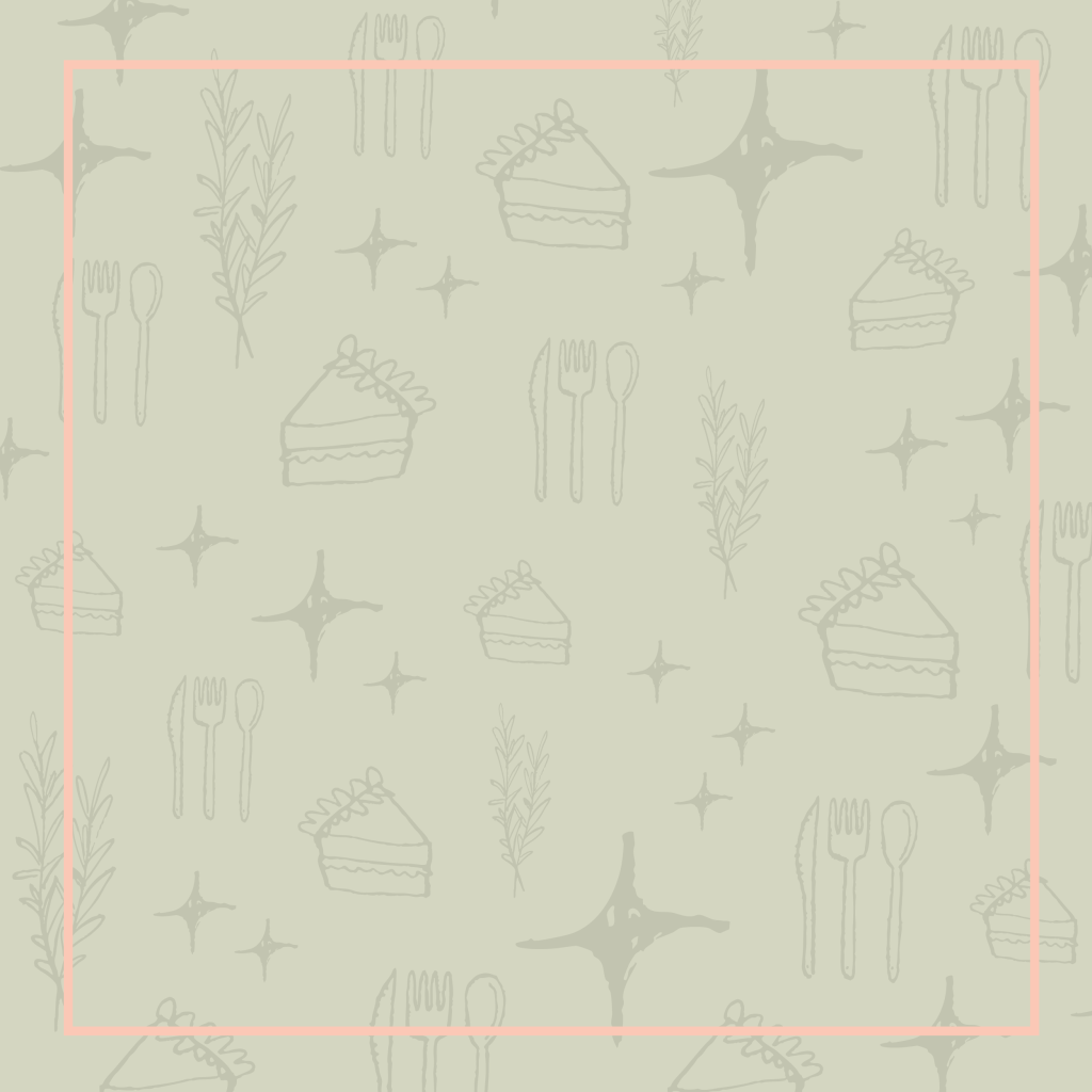
With the final logo selected, I began playing with the chosen brand icons. With one, the star, being included in the logo itself, the owner and I still wanted to incorporate the other icons throughout the brand. As they all have a similar whimsy, I made a pattern that included each one, varying in size, direction, and frequency. I utilized this pattern in many designs such as the introductory Instagram posts below, meant to introduce Good Juju to the social platform. Besides the pattern, the owner and I decided each icon could be put to use depending on the given product / package. For example, if customers purchase a cake from Good Juju their cake package would display the cake slice icon, and if customers were to purchase a catering package, their packaging would display the utensil set, etcetera.

In designing for Good Juju I was able to combine my personal love of illustration with my love of brand design. Seeing my illustrated ideas come to life on a computer screen is always rewarding, and seeing a brand come to life along with them made the experience all the more enjoyable.